HUMANOBrandingBruxellesBelgique001
Premium Branding Agency in Brussels
Creative studio specialized in premium branding and visual identity in Brussels. For ambitious SMEs who want the image of a major brand. Complete visual system delivered in 3 to 5 weeks, free diagnostic in 24h.
The problem
The problem is almost never the logo.
What is missing is the system. A logo drawn five years ago, colours that shift from one medium to the next, a brochure that looks nothing like the website, an Instagram feed that looks like nothing at all. The client sees only one thing. A company smaller than it really is.
HUMANO is an art direction studio based in Brussels. We build complete visual systems for Belgian and international SMEs, in French, English and Spanish. Art direction stays human. Artificial intelligence lets us explore more directions and produce faster. It never decides for you.
Before yours, ours.
The best proof that we know how to build a visual system is the one we built for ourselves.
01 · The signs
Two signs, two jobs. The four arrow isotype names the studio. The letter H, set in the heaviest weight of Inter, signs what the studio makes for its clients: films, campaign visuals, social content. One says who did the work, the other says what it sits on. Both have to work at sixteen pixels in a favicon and at three metres on a shopfront. Anything that does not survive that constraint is dropped.
02 · Photography
The photographic tone belongs to the identity just as much as the logotype. Material, light, framing, distance to the subject. A brand is often recognised by its images before it is recognised by its mark. That is why the photographic treatment is written into the guidelines, with its rules and its prohibitions, rather than left to the taste of the next supplier.

03 · The type system
One family, six weights, a closed grid of sizes. Typographic constraint is what makes a brand identifiable even when the logo is nowhere in sight. It is the piece weak identities neglect first. The system monospace is reserved for contact details and labels, never for the argument. Two voices are enough, and the third typeface is always one too many.
04 · Application
Three values, no fancy. Black carries, white breathes, red decides. A short palette lasts ten years, a wide one ages in two. Red appears only on what commits, a call to action or a brand signature. Never on a number, never on an ornament. A colour that serves everything no longer signals anything.
What you get
Seven deliverables, nothing vague.
- 01
Visual platform
The visual positioning, written down. What the brand must say in five seconds, the territory to hold, the sector codes to respect or to break.
- 02
Logotype and variants
The primary mark and its versions. Horizontal, vertical, monochrome, favicon, use on dark backgrounds. Open vector files.
- 03
Type system and palette
Typefaces, sizes, weights, colours and their uses. A decision grid, not a mood board.
- 04
Brand guidelines
The rules, documented, usable by any supplier who comes after us. You own the system. You are not tied to the studio.
- 05
Social media templates
Templates ready to publish, adaptable in house without going back to a designer. The CiPiCROMIE case below shows the real result.
- 06
Five page website
The identity put online, not just delivered as files.
- 07
Thirty days of support
Time to settle the first real uses and fix whatever rubs.
Real case · Social media
Cipicromie, in colour
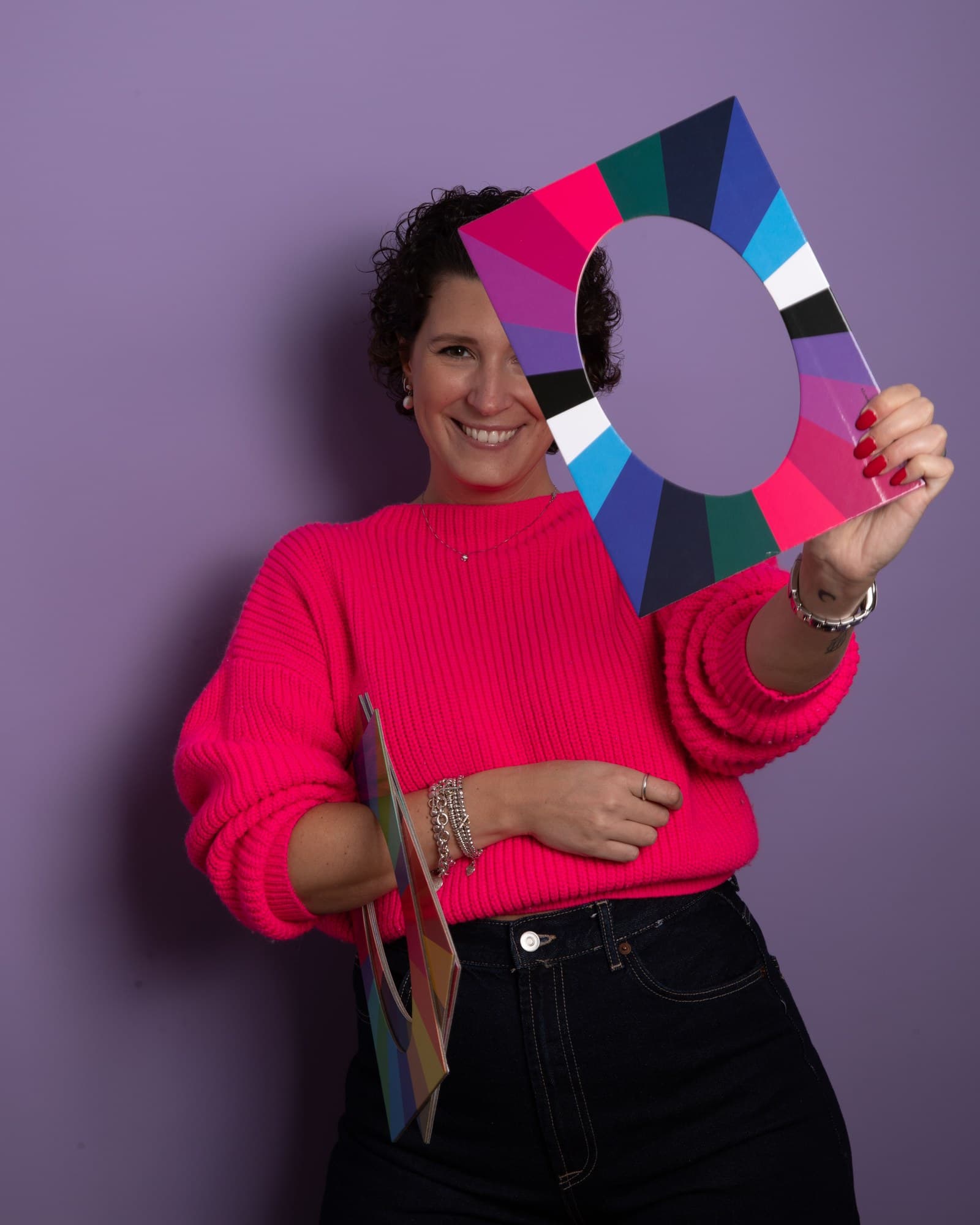
A brand never shows itself all at once. Camilla Petit reveals the colours that suit people. An image consultant between Brussels, Paris and Milan, she masters colour analysis and morphology. We gave her brand a visual system that thinks the way she does. Here is the social media pack, exactly as delivered.
Each opening reveals a fragment of the system built for CiPiCROMIE. A colour, a letter, a crop, a movement. It is the coherence between the fragments that proves there is a system behind them, and not a folder of files.
Four openings move, one at a time.
The system in motion
The same vocabulary, the same restraint, colour landing at the right moment.
The full case study
A vision draped in colour
« La communication a été fluide et les délais ont été respectés. Les templates sont pratiques à utiliser et m'offrent une bonne base pour harmoniser mon identité visuelle. Merci de tout cœur pour ce travail. Je referai appel pour la suite. »
Camilla Petit — CiPiCROMIECiPiCROMIE, image consulting in BrusselsRead the review on Google
Read the case studyFrom the brand to the system.
Who it is for
For SMEs that refuse the generic look.
We work with companies that refuse the generic image. A restaurant, an aesthetic clinic, an estate agency, a craftsman. The sector changes with every project. The standard never does.
- HORECA restaurants and growing fashion brands that want to break out of the generic standard
- Founders of ambitious SMEs targeting a demanding clientele, not low-end volume
- Premium real estate agencies, financial brokers, aesthetic clinics structuring their image seriously
Sectors
Every sector has its codes and its traps.
Branding a restaurant in Brussels is not the same job as building the identity of an aesthetic clinic. One has to hold on a menu reprinted every week and on a storefront seen from across the street, the other has to earn trust before the first appointment. An estate agency does not face the same rollout constraints as a craftsman who signs off his own deliveries.
We start from your real clients and the materials you actually use.
To go further, see premium visual identity, AI augmented art direction, AI creative studio.
Beyond the screen
Art direction for the space
For a restaurant, an aesthetic clinic or a showroom, the space is the brand's first medium, long before the website. We carry the art direction into the room. Materials, colours, furniture, light, signage.
This is not interior decoration in the usual sense, but the same decision grid applied to another medium. The client who walks through the door has to recognise the brand they saw online.
Materials
What the hand touches. Wood, metal, textile, finishes.
Light
Temperature and intensity. What it brings forward, what it leaves in shadow.
Furniture
The shapes that carry the brand, from the counter to the waiting chair.
Signage
The name, the landmarks, the directions. The brand typography placed in the room.
Frequently asked
What clients ask before they sign.
How much does branding cost in Brussels?
The price depends on scope. A basic identity for a freelancer, a complete visual system for an SME and a multi channel rollout are not priced the same way. At HUMANO, a complete visual system starts at 3,500 euros. The diagnostic is free and the quote is fixed, never billed by the hour.
How long does a visual identity take?
Three to five weeks for a complete visual system, from brief sign off. The timeline depends mostly on how fast you respond at validation points. A project driven by a single founder moves faster than one with several decision makers.
What is the difference between a logo and a visual identity?
The logo is a mark. The visual identity is the system that makes that mark recognisable everywhere. Colours, typefaces, layout, image treatment, tone of the visuals. A company with a beautiful logo but no system looks different on every medium, and that inconsistency costs credibility at every contact.
Do you work with SMEs or with larger organisations?
Both. SMEs are the core of what we do, because the studio exists so that a five person company does not have to settle for a five person image. But the method does not change with the size of the client. We also work with more established organisations, and with groups that have several brands to hold together, in Belgium and abroad. Restaurants and HORECA venues, aesthetic clinics, estate agencies, independent brands, and companies running a portfolio of brands.
Does artificial intelligence replace the designer?
No, it replaces the waiting. AI produces variations and campaign visuals far faster, under human art direction. Nothing ships without being judged, corrected and arbitrated. An identity generated with no human eye is recognisable on sight, and that is exactly what we avoid.
Should we rebuild the whole brand or let it evolve?
Both happen. A full rebuild is justified when the positioning has changed or when the image works against the company. An evolution is enough when the foundations hold but the rollout is inconsistent. The diagnostic settles it before any commitment, and we do recommend evolution over rebuild when that is the honest answer.
Do you work outside Brussels?
Yes. The studio is based in Brussels and works across Belgium, Luxembourg, France and Spain, in French, English and Spanish. The process is identical remotely, with validations by video call.
How do we start a project with HUMANO?
Through the online brief. You answer a series of questions about your brand and your market, then you get a diagnostic within 24 hours. Free, no strings attached. If there is a project, we send a fixed quote with scope and schedule.